
ClientAscension
Project NameAscension Catechism (Ad)
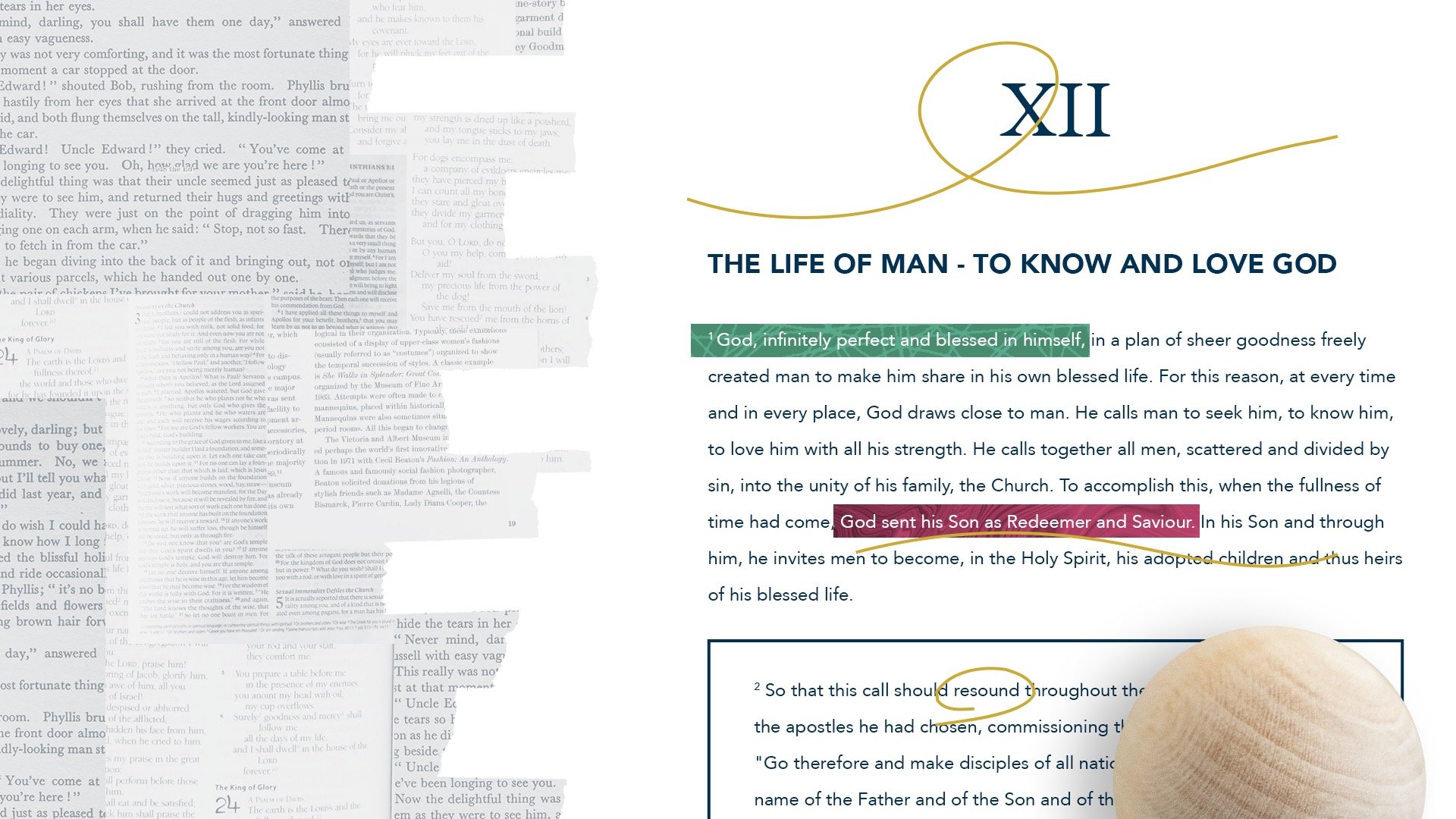
How do you make a textbook natural and easy to read?
The team at Ascension wanted to provide a reading experience that connected the dots between sections of the Church’s “textbook on doctrine” to help readers understand the integrated nature of the whole document and to make it come alive as a helpful resource for the modern church.


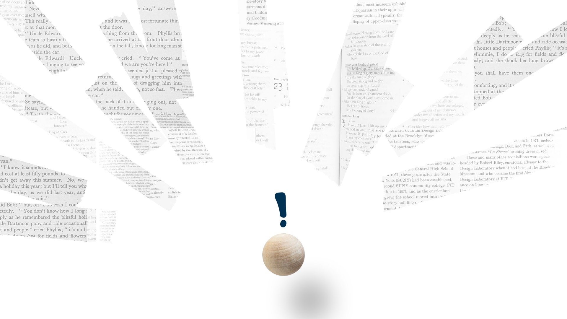


Dense, prickly type blocks are transformed by colorful waves as the ball character moves from anxiety to apprehension.
As we’ve done with the Ascension team before, deliverables included a primary 60 second edit along with 30- and 15-second cut downs at three different aspect ratios for social. We architected a special project setup that accommodated for these formats while allowing for the least amount of rework.
See it live in the wild
Check out the product at AscensionPress.com